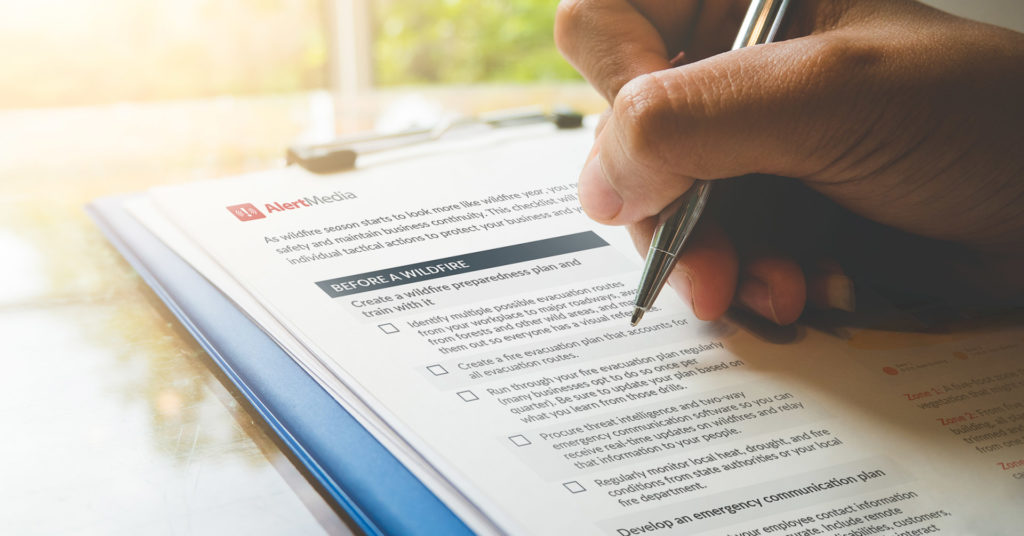
Use this checklist to prepare your business for a wildfire evacuation and keep your people safe.
Safety and Security Aug 11, 2023
Wildfire Preparedness and Evacuation Checklist [Free Tool]
Wildfire Safety Checklist
Perform a business “temperature check” that ensures your people are prepared before, during, and after a wildfire.
Wildfires used to be considered a concern for businesses only in drought-prone areas like California and the southwestern U.S., but that is no longer the case. With increasing drought conditions and rising temperatures from climate change, wildfires are worsening all across the globe—and they are putting more people and businesses at risk.
“In the last 17 years, we have had the 10 largest fires in U.S. history,” U.S. Fire Administrator Dr. Lori Moore-Merrell told us on a recent episode of The Employee Safety Podcast. “That includes the Camp Fire, the Paradise Fire, the Woolsey Fire, the Caldor Fire. We are looking at fires that are massive, over 100,000 acres burning. It’s a stunning amount of land. But there’s also the home losses and the deaths that have occurred in these fires.”
Meteorologist Advice for Wildfire Preparedness
Jason Moreland, Senior Meteorologist at AlertMedia, joins us to discuss everything organizations need to know to prepare for wildfires.
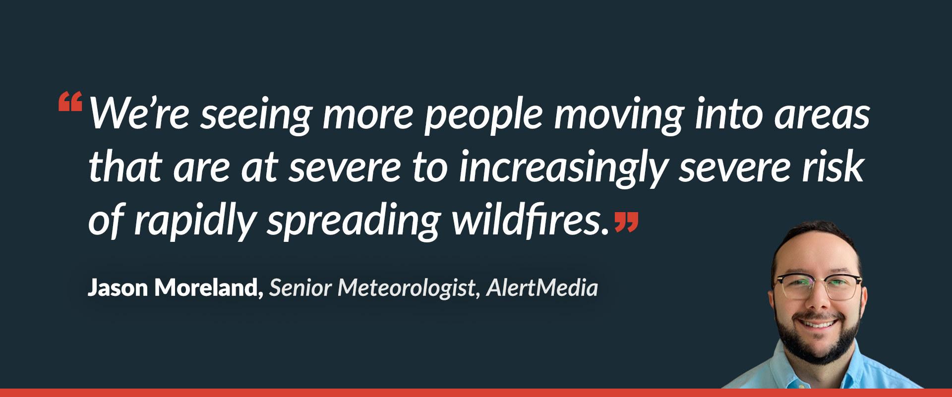
To compound the dangers, wildfires are no longer limited to their regular season of the hottest, driest months of summer and fall. “It’s becoming increasingly clear that wildfire season is now a year-round threat, and trends within the data also suggest that wildfires will continue to grow both in volume and severity,” Jason Moreland, Senior Meteorologist here at AlertMedia, told us in a podcast episode.
Whether you operate out of a fire-prone area or have employees or facilities in a high-risk wildland urban interface, you should be paying attention to your wildfire risk. You may find yourself in the path of one of these highly destructive disasters for the first time, so it’s important to know exactly how you can keep your people and facilities safe.
The wildland urban interface (WUI) is an area of land that transitions from urban to wilderness, where human structures are integrated with undeveloped land. These areas are very prone to wildfires and can see higher structural damage than other environments.
This article will break down how to go through your wildfire preparedness and wildfire evacuation checklist so that your business and employees are ready to respond at the first sign of a spark. You can also download this free checklist for easy-to-follow steps that will make the whole process run smoothly.
Why Wildfire Preparedness Is Critical for Business
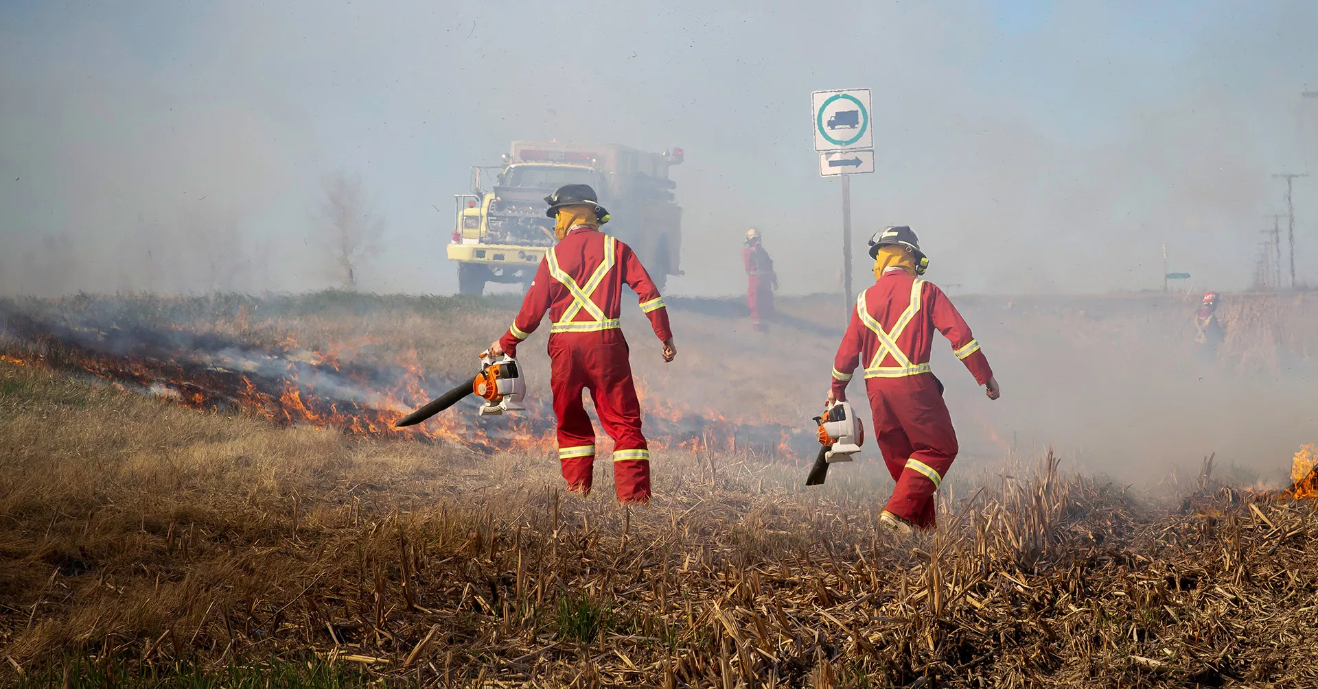
Wildfires are fast-moving emergencies and can spring up out of nowhere. Unlike hurricanes and other natural disasters, there is not much predictability as to where a fire might go, and factors like wind and fuel availability can change the fire’s course in seconds. This means that once a fire has started, you may have very little time to react. That’s where wildfire preparedness comes in.
While most fires affect uninhabited areas, the number of structures damaged and destroyed has increased drastically over the last 40 years. And more structures are at risk as the number of people living in WUI spaces increases. Between 2000 and 2018, between 86% and 97% of wildfire structure damage occurred in areas designated as WUI.
More and more businesses every year are facing wildfires as a serious threat to people and property. And while you can never fully eliminate the risk of damage, having an emergency plan can make a huge difference. Setting your employees up with supplies and evacuation routes will prevent last-minute scrambling, and preparing your facility can stop or limit building loss when a fire approaches. A checklist of tasks, both your overall emergency management and preparedness as well as the specifics of a wildfire evacuation, can help you prepare without having to guess about best practices.
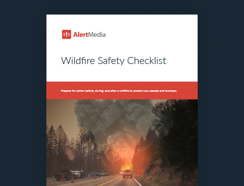
 Preview of Wildfire Safety Checklist
 Equip your organization to handle a wildfire with this free checklist.
How to Use This Wildfire Preparedness Checklist
Once you download the wildfire preparedness checklist, put time on the calendar for your safety team to assess your readiness and optimize wildfire response plans for before, during, and after a wildfire. Here’s what to expect from comprehensive preparedness efforts.
Before a Wildfire
When: Review this portion of the checklist as soon as possible—before weather conditions are favorable for a fire and local fire departments warn of high risk.
1. Build a plan
If you don’t already have one, now is the time to create your wildfire preparedness plan. This should include all processes for managing the effects of wildfires, such as your evacuation plan and evacuation routes, general fire safety guidelines, and even procedures for how to protect important documents. Be sure to check your insurance policy and understand your coverage. Establish a wildfire communication plan for how you will stay in touch with employees, vendors, and local authorities. Keep contact information like phone numbers up to date in your mass notification system so you can send quick and reliable messages.
2. Prepare your facility
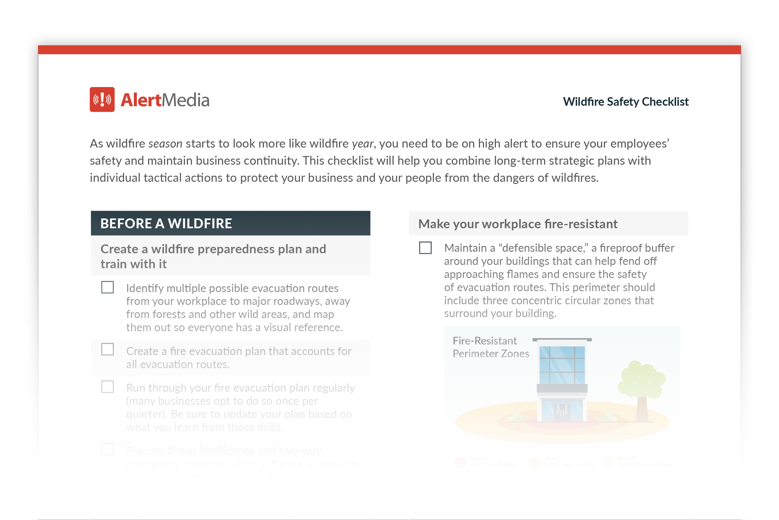
Get your buildings and physical structures ready for a potential fire. Clear out any fire hazards—including propane tanks, trash cans, or combustible patio furniture—and adapt your landscaping to create a defensible space around your building. You also want to set up emergency supply kits with necessary items.
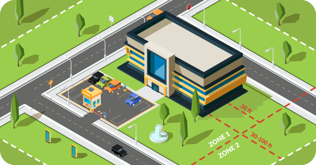
Defensible space is a fire break buffer zone between your building and nearby combustible materials—such as trees, shrubs, and grass—that serves to slow a fire and limit damage.
During a Wildfire
When: This portion of the checklist offers critical reminders for when a local fire begins but is still far enough away that you have time to mobilize.
3. Track the fire
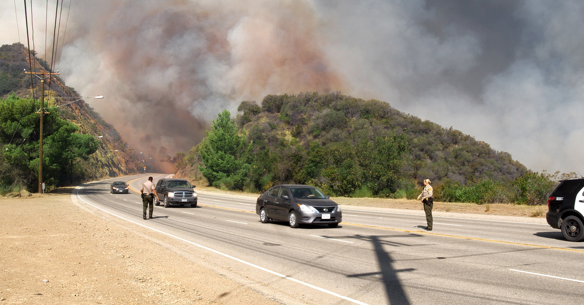
As soon as you know a local fire has started, set up a system to track its progress. You can manually check fire information sources like CalFire, your local fire department, or even social media. Alternatively, you can set up an automated threat intelligence system that can notify you of the fire’s progress. Keep a close eye out for evacuation orders because as soon as the alert is sent, everyone needs to evacuate, including you, your employees, and their family members and pets.
4. Check supplies
When you prepared your facility, you set up your emergency supplies, but you will want to double-check them now that a fire is approaching. Ensure everything is in order and ready to grab if an evacuation is called. Here are some items you can consider for your go bag:
- Car keys
- Valuables
- First aid kit
- Chargers
- Long pants and long-sleeved shirts
- Extra batteries
- Battery-powered portable radio
- Toiletries
- Non-perishable food and water
- Map of evacuation routes
As you are performing supply checks, set cell phones and laptops to charge, and pay attention to local radio so you don’t miss important notifications. If you are able to, make sure your irreplaceable and important documents (driver’s licenses, birth certificates, medical records, family heirlooms, hard drives, etc.) are stowed safely in fireproof safes or taken with you.
5. Evacuate if necessary
When you get the notification from your fire department, evacuate immediately. Don’t delay to get final things in order. While evacuation is not always necessary, depending on the movement of the fire—if it is ordered, that means you are in imminent danger and you must leave. You should even consider leaving when a voluntary evacuation is called to ensure your people are safe and not caught up in a last-minute rush—or caught up in traffic leaving the threatened area. Business owners and homeowners might feel compelled to stay to protect their buildings, but this decision only gets in the way of firefighters trying to stop the flames. Be sure to clearly communicate your designated meeting place to anyone who might be evacuating.
After a Wildfire
When: Go through this portion of the checklist as soon as you are out of harm’s way and the fire has moved on or been controlled.
6. Check in and maintain communication
As soon as possible after the fire, reach out to your employees, making use of easy communication templates. Send a wellness survey to ensure everyone is safe, and ask if anyone needs assistance. Likely you will have employees who are having to deal with their own homes and damages, so checking in immediately will help you assess what needs to be done and where the most help is needed. Maintain communication in case conditions or recommendations change and so you can update employees of business operations.
7. Return to the building—assess and respond to damage
When authorities tell you it is safe to do so, you can return to your building and assess the situation. Approach with caution as structural and electrical damage may pose hazards to people on site. If your facilities are damaged, reach out to your insurance company and/or federal aid centers like FEMA to coordinate a professional inspection. Keep in mind that there may be problems even if your building did not catch fire, like smoke damage, or there might be damage to the roads or landscaping that would affect your operations. Once you have made your assessment, you can determine what your path to recovery looks like.
8. Reassess your response
After you have recovered from the fire, it’s time to review how things went. Recall your wildfire response from beginning to end and evaluate what went well, what didn’t, and how you might adjust your response procedures to be more effective in the future. Using a document like an after-action report can help structure these reassessments and give you a concrete pathway to improving your response for the next wildfire. This process will help ensure you don’t make the same mistakes multiple times.
Prioritize Your People and Business Continuity With Wildfire Safety
Your people are your biggest asset, and it’s your responsibility to ensure that they can stay safe when an emergency like a wildfire occurs. Rely on tools like this preparedness checklist to ensure you are ready when seconds count—so your employees have the time and resources they need to take care of themselves and their families.
By planning ahead, you ensure that you are in the best position to respond immediately, without having to scramble for valuables or worry about if someone knows where to go when directed to evacuate. Download the wildfire checklist to start preparing today. And ensure the best possible outcomes for business continuity amidst wildfire risks.
Wildfire Safety Checklist
Perform a business “temperature check” that ensures your people are prepared before, during, and after a wildfire.
AlertMedia, Risk Intelligence and Response